A next-generation robotic surgical platform that combines immersive VR control with advanced sensing and computer vision. I led UX strategy and interaction design, building a scalable system that improves training access, reduces complexity, and enhances surgical outcomes.
Most people picture open surgery—large incisions, long recovery times. Laparoscopic (minimally invasive) surgery changed that with small incisions and long tools. But it’s difficult to learn and perform.
Robotic-assisted surgery takes things further. Instead of wielding tools directly, the surgeon uses a console to control robotic arms, allowing greater precision with smaller incisions.
But current systems are bulky, expensive, and hard to learn—limiting who can use them and where.
Key Pain Points Addressed
- Access & cost: Large systems are expensive and require dedicated space, limiting adoption
- Training: Limited access to intuitive, VR-based training tools makes onboarding difficult.
- Hardware constraints: Traditional robotic arms restrict positioning and range of motion.
- Poor UX: Existing UIs were created by engineers for functionality, not usability.
Design Strategy
Our goal was to rethink what a surgical robot could be: more portable, more intuitive, and VR-native. We focused on:
- Miniaturized hardware: The robot fits inside the patient, freeing up space and increasing flexibility.
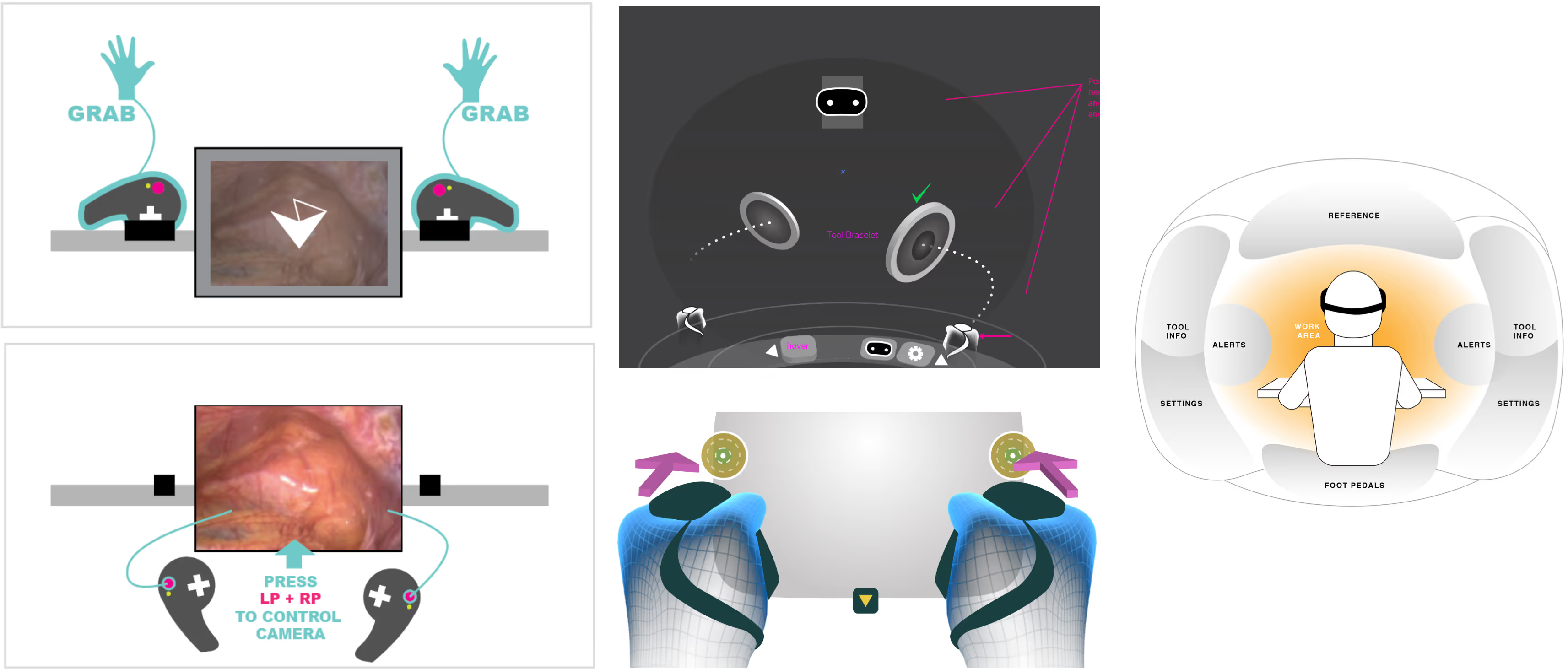
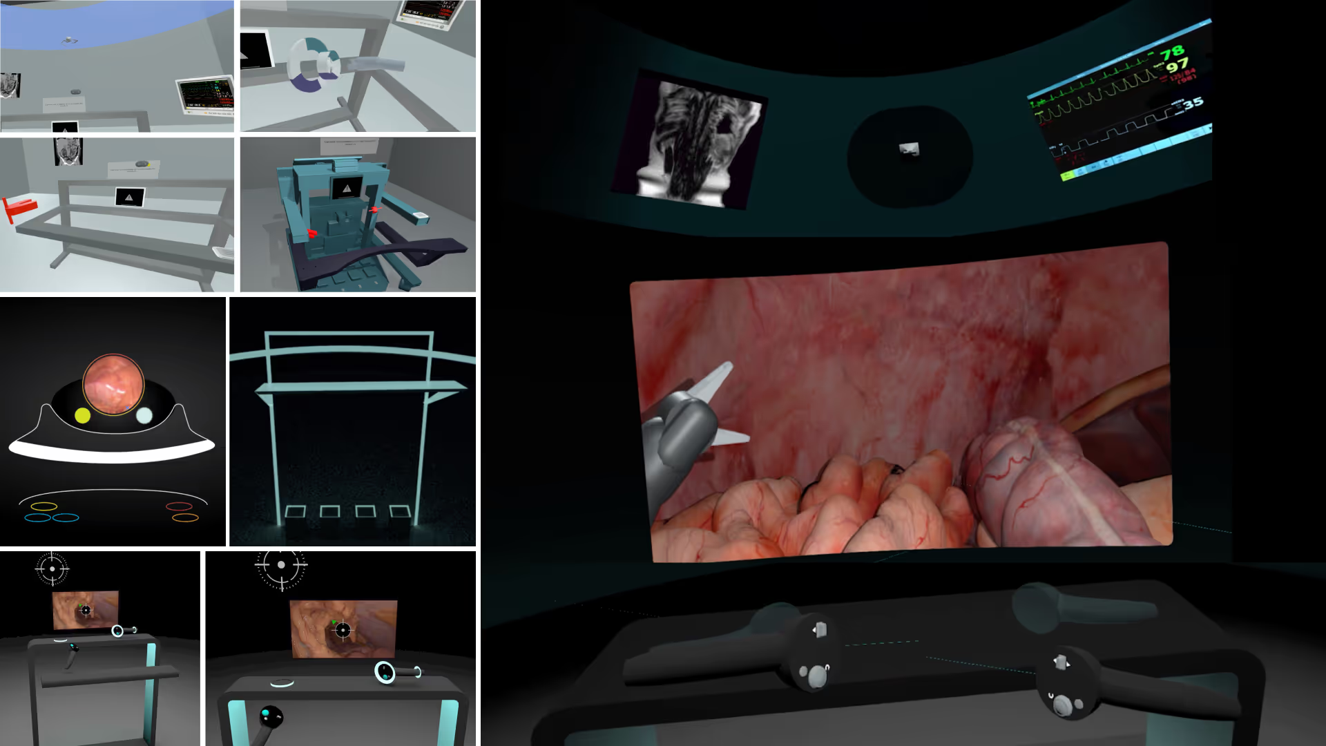
- Immersive VR control: Surgeons view a stereoscopic camera feed and use tracked arm controllers for natural, intuitive motion.
- Virtual training & remote collaboration: Leveraging consumer VR headsets for access anytime, anywhere.
My Role & Contributions
I was responsible for UX strategy, user research, interface design, and cross-functional collaboration. I established a design system and roadmap in a highly technical, engineering-driven environment. My work directly contributed to making robotic surgery more accessible, both in terms of system usability and market reach.
UX Strategy & Research
- Conducted surgeon interviews to map workflows and identify usability gaps.
- Partnered with product to translate user needs into a roadmap.
- Led design validation using iterative prototyping with real users.

Design System & Process
- Created a flexible design system enabling engineers and PMs to build UI features without bottlenecks.
- Standardized patterns for 2D and 3D interactions across the product.
- Documented UI principles and visual guidelines for internal consistency.

Interface Design & Prototyping
- Redesigned existing engineer-built UIs using standard design patterns.
- Built prototypes in Unity to simulate real-world use and gather feedback.
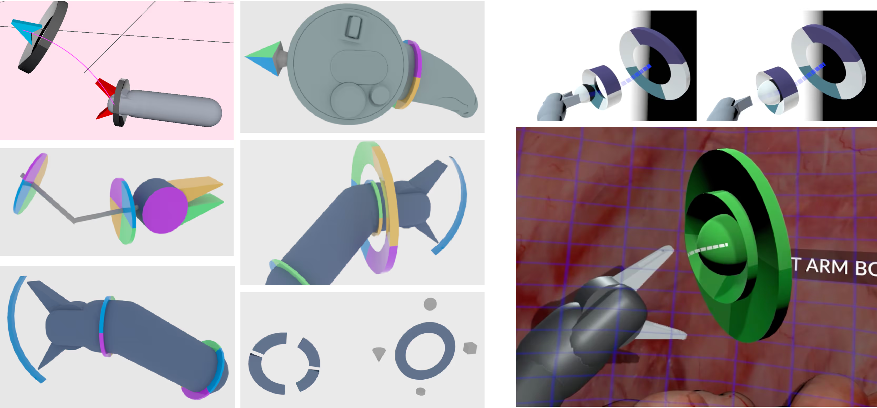
- Focused on reducing complexity and cognitive load by grouping tools into context-sensitive modes.

Advanced Sensing & Visualization
- Designed tools for pre-op camera insertion, mapping the body using photogrammetry.
- Created features for reference markers, live measurements, and anatomy recognition.
- Integrated computer vision to surface relevant data and reduce manual overhead.
Adaptive, Contextual UI
Managing tools in VR added cognitive burden—especially for surgeons unfamiliar with gaming-style controls. To improve usability:
- We broke toolsets into contextual modes, reducing perceived complexity.
- UI elements were placed spatially within the anatomy map, staying out of the way when not needed.
- Visual contrast automatically adjusted based on background complexity for legibility.
Results
Our approach empowered surgeons with more intuitive control, better visibility, and faster onboarding while reducing cost and footprint. We laid the groundwork for a surgical platform that could scale beyond large hospital systems and into more hands, more quickly.


